FREE

3 Images Available
Design SystemInstant Whop Delivery
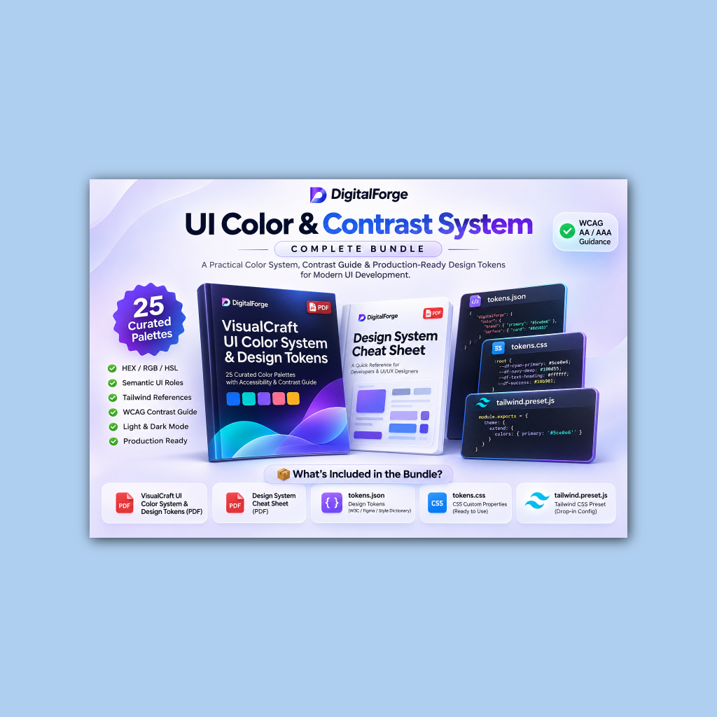
UI Color & Contrast System • Tokens & Playbook Bundle
25 battle-tested accessible palettes, drop-in Tailwind & CSS presets, plus visual design cheat sheets.
Free
Completely FreeClaim for Free on Whop↗
Instant file unlockCommercial licenseFree updates
Key Highlights
- ✓25 Curated accessible color palettes with full semantic UI roles
- ✓Light and dark mode token mappings with WCAG AA/AAA compliance
- ✓Ready-to-use tokens.json for Figma, Style Dictionary, and W3C spec
Free Developer Preview
Free Sample: Semantic Tokens & CSS Variables
Download a production-ready sample of our semantic color tokens (JSON) with light & dark theme values and WCAG contrast metadata.
digitalforge-sample-tokens.jsonjson preview
{
  "color": {
    "brand": {
      "cyan": { "value": "#5CE0E6", "type": "color" },
      "teal": { "value": "#007676", "type": "color" },
      "dark": { "value": "#080D14", "type": "color" }
    },
    "semantic": {
      "background": { "light": "#FAFAF8", "dark": "#080D14" },
      "foreground": { "light": "#0F172A", "dark": "#F8FAFC" },
      "border": { "light": "rgba(15,23,42,0.08)", "dark": "rgba(255,255,255,0.08)" },
      "accent": { "value": "#5CE0E6", "contrastRatio": "7.2:1" }
    }
  }
}Product Overview
A complete, battle-tested UI color architecture crafted for modern frontend engineers and product designers. Includes 25 accessible palettes, WCAG contrast compliance guides, design tokens in JSON and CSS, and a drop-in Tailwind CSS preset to eliminate design-to-code friction.
All Included Features & Deliverables
25 Curated accessible color palettes with full semantic UI roles
Light and dark mode token mappings with WCAG AA/AAA compliance
Ready-to-use tokens.json for Figma, Style Dictionary, and W3C spec
tokens.css custom properties ready for immediate stylesheet import
Drop-in tailwind.preset.js for effortless project styling
Includes VisualCraft UI Color System & Design System Cheat Sheet (PDF)
What's Inside Your Download
- VisualCraft UI Color System & Design Tokens Guide (PDF - 48 Pages)
- Design System Cheat Sheet for Designers & Developers (PDF - Quick Ref)
- tokens.json (W3C Design Token Community Group / Figma Token format)
- tokens.css (Ready-to-use CSS Custom Properties for light/dark themes)
- tailwind.preset.js (Drop-in Tailwind preset with semantic color mappings)
- Commercial license document granting perpetual commercial rights